Switching themes
programmatically
This post is a continuation of android themes and styles part I and II.
In this section we are going to learn to:
1.
Dynamically set the theme of an application from
existing themes whether system or custom
2.
Reference a theme from code, I assure you, I
also thought it’s so obvious.
Dynamically setting the
theme of our application
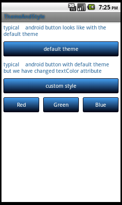
This time, we shall start our changes from the main.xml file, let’s just quickly add 3
buttons in a horizontal linear layout corresponding to our 3 themes. These
buttons will be used alongside one of the initial buttons (default theme) to
switch between themes at runtime. Below is our new code for main.xml
xml version="1.0"
encoding="utf-8"?>
<LinearLayout xmlns:android="http://schemas.android.com/apk/res/android"
android:orientation="vertical" android:layout_width="fill_parent"
android:layout_height="fill_parent">
<TextView style="@style/myTextView"
android:text="typical
android button looks like with the
default theme"
/>
<Button style="@style/myButton"
android:text="default theme" android:id="@+id/default_theme" android:onClick="onClick"/>
<TextView style="@style/myTextView"
android:text="typical
android button with default theme
but we have changed textColor attribute" />
<Button style="@style/myButton"
android:text="custom style" />
<LinearLayout android:layout_width="fill_parent"
android:layout_height="wrap_content"
android:weightSum="3">
<Button style="@style/myButton"
android:text="Red" android:id="@+id/red"
android:layout_weight="1" android:onClick="onClick"></Button>
<Button style="@style/myButton"
android:text="Green" android:id="@+id/green"
android:layout_weight="1" android:onClick="onClick"></Button>
<Button style="@style/myButton"
android:text="Blue" android:id="@+id/blue"
android:layout_weight="1" android:onClick="onClick"></Button>
</LinearLayout>
Notice how we have referenced our onclick handler from xml,
onClick is a
method we shall create in our main Activity class.
We now go to ThemeAndStyleActivity.java
and edit for new functionality.
package
com.simplejavan.theme;
import
android.app.Activity;
import
android.content.Intent;
import android.os.Bundle;
import android.view.View;
public class
ThemeAndStyleActivity extends Activity{
@Override
public void onCreate(Bundle
savedInstanceState) {
Intent intent=getIntent();
if(intent!=null &&
intent.getExtras() !=null && intent.getExtras().containsKey("theme")){
int theme =
getIntent().getExtras().getInt("theme");
getApplication().setTheme(theme);
setTheme(theme);
}
super.onCreate(savedInstanceState);
setContentView(R.layout.main);
}
public void onClick(View v) {
if(v.getId() == R.id.blue){
Intent i = new Intent(this,ThemeAndStyleActivity.class);
i.putExtra("theme", R.style.Theme_Blue);
startActivity(i);
}
if(v.getId()== R.id.green){
Intent i = new Intent(this,ThemeAndStyleActivity.class);
i.putExtra("theme", R.style.Theme_Green);
startActivity(i);
}
if(v.getId() == R.id.red){
Intent i = new Intent(this,ThemeAndStyleActivity.class);
i.putExtra("theme", R.style.Theme_Red);
startActivity(i);
}
if(v.getId() == R.id.default_theme){
Intent i = new Intent(this,ThemeAndStyleActivity.class);
i.putExtra("theme", android.R.style.Theme_Black);
startActivity(i);
}
finish();
}
}
Notice a few things in the above code:
- · When referencing a system theme in
code, we append the
android namespace(check the last “if” block) unlike a custom theme. - · When referencing themes in code, periods
are replaced by underscores, thus
Theme.BluebecomesTheme_Blue
One last
thing to do is to adjust the manifest
xml. Now we would want our app to
load with the default theme and then we shall see how our app switches
themes as we wish. So just go ahead and remove the explicit definition of theme
in the manifest like so:
xml version="1.0"
encoding="utf-8"?>
<manifest xmlns:android="http://schemas.android.com/apk/res/android"
package="com.simplejavan.theme"
android:versionCode="1"
android:versionName="1.0">
<uses-sdk android:minSdkVersion="8"
/>
<application
android:icon="@drawable/icon"
android:label="@string/app_name">
<activity android:name=".ThemeAndStyleActivity"
android:label="@string/app_name">
<intent-filter>
<action android:name="android.intent.action.MAIN"
/>
<category android:name="android.intent.category.LAUNCHER"
/>
</intent-filter>
</activity>
</application>
</manifest>
You can now
reload the application and observe our changes, below are my screen shots:
 |
| Theme.Green |
 |
| Theme.Red |
 |
| Theme.Blue |
You are now
very clear about loading themes dynamically, next we shall cover colors .xml in android and how
separating colors from styles is very helpful.
Android colors.xml.
Just as we
created styles.xml and themes.xml in the res/values folder, color definitions are no different, only that
the
styles element in the xml is replaced by color
and the value is a hex color reference starting with #.
To
demonstrate that, we shall create res/layout/colors.xml. All our color
references in the styles will now be moved here like so:
xml version="1.0"
encoding="utf-8"?>
<resources>
<color name="red_light">#ff0000</color>
<color name="red">#bb0000</color>
<color name="green_light">#00ff00</color>
<color name="green">#00bb00</color>
<color name="blue_light">#449def</color>
<color name="blue">#2f6699</color>
<color name="white">#ffffff</color>
<color name="dark_fade">#000011</color>
<color name="black">#000000</color>
</resources>
I hope the
pattern is very clear since it resembles that of styles.xml which we already covered.
Since we are
all about demonstration, this is a miniature version of a typical colors xml in
a major application. To get a more complete list, please check out this stackoverflow question.
We can now
adjust the styles2.xml, our global
style resource, to reference its colors rather that declaring them explicitly,
the syntax is very easy and similar to the way we reference styles that I don’t
even think it’s worth explaining, here is the code:
<resources>
<style name="greenTheme.Button"
parent="@android:style/Widget.Button">
<item name="android:textColor">@color/green</item>
</style>
<style name="greenTheme.TextView"
parent="@android:style/Widget.TextView">
<item name="android:textColor">@color/green </item>
</style>
<style name="redTheme.Button"
parent="@android:style/Widget.Button">
<item name="android:textColor">@color/red</item>
</style>
<style name="redTheme.TextView"
parent="@android:style/Widget.TextView">
<item name="android:textColor">@color/red</item>
</style>
<style name="blueTheme.Button"
parent="@android:style/Widget.Button">
<item name="android:textColor">@color/blue</item>
</style>
<style name="blueTheme.TextView"
parent="@android:style/Widget.TextView">
<item name="android:textColor">@color/blue</item>
</style>
</resources>
We have even
made our code more maintainable by using color references rather than explicit
values. This is another classic example of separation of concerns, very important in developing
software.
You can reload
your app and test that nothing has changed since we have simply moved our
colors from the styles xml to their own file and called them by reference. Nothing
changes.
Somebody
must be wondering if the word color in
the
expression refers to
the file name.
The answer is NO.
The name of
values files don’t really matter, what matters is the
resource
tag and the tag referring to what type of values these are. The common resource
type tags in res/values are:- ·
string- for the string resources - ·
style- for style resources - ·
color- for color resources
The above
statement means that even if colors.xml
file was called mykala.xml or the styles.xml file was called mystyles.xml but the contents remained
the same, it would not matter.
Complex Colors
You might
have observed that all our demonstrations on color and themes have been leaving
out the
Button view. I intended this.
You see, we
have been talking about simple colors and then there are complex colors. You can
understand this better with the example we are going to see shortly.
If we had
given our buttons a plain background color say green or red, they would have
looked clumsy. We all know that at one point you may click a button to execute
a function. Imagine clicking a button and you don’t see any difference in the
way it appears, you don’t know if it responded to your click or if there is
actually something happening in the background.
So usually,
to make our apps more responsive, we have to cater for state transitions in
such clickables as buttons. Meaning if a button is green in color, when I click
it and at the instant of clicking it appears light green and then on releasing,
it returns back to the original green, I as the user will know something is
happening. This is called “making the UI responsive”. We can achieve this in
android using complex colors.
Having understood
the fundamentals of complex colors, we can now make the buttons participate in
the theming party.
Previously,
we have been making all our texts correspond to the theme color. Since we are
going to color the button backgrounds as well, we may not be able to read the
texts on them like that, so let’s start by changing the button text colors.
Go to
styles2.xml and change the text
colors to black.
Create 3 xml
files, this time not in res/values but rather in res/drawables. Call them
- · blue_button_selector.xml
- · red_button_selector.xml
- · green_button_selector.xml
clear all
the autogenerated content in them and put this instead:
blue_button_selector.xml
xml version="1.0"
encoding="utf-8"?>
<selector xmlns:android="http://schemas.android.com/apk/res/android">
<item android:state_pressed="true"
android:state_focused="false">
<shape>
<gradient android:angle="270"
android:endColor="@color/blue_light"
android:startColor="@color/blue_light" android:centerColor="@color/blue_light" />
<stroke android:width="1dp"
android:color="@color/blue_light" />
<corners android:radius="3dp"
/>
<padding android:bottom="10dp"
android:left="10dp"
android:right="10dp" android:top="10dp"
/>
</shape>
<inset></inset>
</item>
<item android:state_pressed="true"
android:state_focused="true">
<shape>
<gradient android:angle="270"
android:endColor="@color/blue_light"
android:startColor="@color/blue_light" android:centerColor="@color/blue_light" />
<stroke android:width="1dp"
android:color="@color/blue_light" />
<corners android:radius="3dp"
/>
<padding android:bottom="10dp"
android:left="10dp"
android:right="10dp" android:top="10dp"
/>
</shape>
</item>
<item android:state_pressed="false"
android:state_focused="false">
<shape>
<gradient android:angle="90"
android:startColor="@color/dark_fade"
android:endColor="@color/blue_light"/>
<stroke android:width="1dp"
android:color="@color/dark_fade" />
<corners android:radius="3dp"
/>
<padding android:bottom="10dp"
android:left="10dp"
android:right="10dp" android:top="10dp"
/>
</shape>
</item>
<item android:state_pressed="false"
android:state_focused="true">
<shape>
<gradient android:angle="90"
android:endColor="@color/blue_light"
android:startColor="@color/dark_fade" />
<stroke android:width="1dp"
android:color="@color/blue_light" />
<corners android:radius="3dp"
/>
<padding android:bottom="10dp"
android:left="10dp"
android:right="10dp" android:top="10dp"
/>
</shape>
</item>
</selector>
red_button_selector.xml
xml version="1.0"
encoding="utf-8"?>
<selector xmlns:android="http://schemas.android.com/apk/res/android">
<item android:state_pressed="true"
android:state_focused="false">
<shape>
<gradient android:angle="90"
android:endColor="@color/red_light"
android:startColor="@color/red_light" android:centerColor="@color/red_light" />
<stroke android:width="1dp"
android:color="@color/red_light" />
<corners android:radius="3dp"
/>
<padding android:bottom="10dp"
android:left="10dp"
android:right="10dp" android:top="10dp"
/>
</shape>
</item>
<item android:state_pressed="true"
android:state_focused="true">
<shape>
<gradient android:angle="90"
android:endColor="@color/red_light"
android:startColor="@color/red_light" android:centerColor="@color/red_light" />
<stroke android:width="1dp"
android:color="@color/red_light" />
<corners android:radius="3dp"
/>
<padding android:bottom="10dp"
android:left="10dp"
android:right="10dp" android:top="10dp"
/>
</shape>
</item>
<item android:state_pressed="false"
android:state_focused="false">
<shape>
<gradient android:angle="90"
android:endColor="@color/red"
android:startColor="@color/dark_fade"/>
<stroke android:width="1dp"
android:color="@color/red" />
<corners android:radius="3dp"
/>
<padding android:bottom="10dp"
android:left="10dp"
android:right="10dp" android:top="10dp"
/>
</shape>
</item>
<item android:state_pressed="false"
android:state_focused="true">
<shape>
<gradient android:angle="90"
android:endColor="@color/red_light"
android:startColor="@color/dark_fade" />
<stroke android:width="1dp"
android:color="@color/red_light" />
<corners android:radius="3dp"
/>
<padding android:bottom="10dp"
android:left="10dp"
android:right="10dp" android:top="10dp"
/>
</shape>
</item>
</selector>
green_button_selector.xml
xml version="1.0"
encoding="utf-8"?>
<selector xmlns:android="http://schemas.android.com/apk/res/android">
<item android:state_pressed="true"
android:state_focused="false">
<shape>
<gradient android:angle="90"
android:endColor="@color/green_light"
android:startColor="@color/green_light" android:centerColor="@color/green_light" />
<stroke android:width="1dp"
android:color="@color/green_light" />
<corners android:radius="3dp"
/>
<padding android:bottom="10dp"
android:left="10dp"
android:right="10dp" android:top="10dp"
/>
</shape>
</item>
<item android:state_pressed="true"
android:state_focused="true">
<shape>
<gradient android:angle="90"
android:endColor="@color/green_light"
android:startColor="@color/green_light" android:centerColor="@color/green_light" />
<stroke android:width="1dp"
android:color="@color/green_light" />
<corners android:radius="3dp"
/>
<padding android:bottom="10dp"
android:left="10dp"
android:right="10dp" android:top="10dp"
/>
</shape>
</item>
<item android:state_pressed="false"
android:state_focused="false">
<shape>
<gradient android:angle="90"
android:endColor="@color/green"
android:startColor="@color/dark_fade" />
<stroke android:width="1dp"
android:color="@color/green" />
<corners android:radius="3dp"
/>
<padding android:bottom="10dp"
android:left="10dp"
android:right="10dp" android:top="10dp"
/>
</shape>
</item>
<item android:state_pressed="false"
android:state_focused="true">
<shape>
<gradient android:angle="90"
android:endColor="@color/green_light"
android:startColor="@color/dark_fade"/>
<stroke android:width="1dp"
android:color="@color/green_light" />
<corners android:radius="3dp"
/>
<padding android:bottom="10dp"
android:left="10dp"
android:right="10dp" android:top="10dp"
/>
</shape>
</item>
</selector>
If you have
never dealt with drawables before, just take it easy, I have posts prepared
already to tackle them indepth.
Just notice
the
item tags
under the selector tags. Each
describes a state of the button during user interaction. The selector
property switches the properties of the view
to which this drawable resource is applied according to the view’s current
state. For a button, the states are:- · pressed and not focused
- · pressed and focused
- · not pressed and not focused
- · not pressed and focused
Everything
else you can ignore for now incase you are not yet familiar with them.
I can now
show you the new styles2.xml with
the changed text colors and now references to these drawable resources for the
button backgrounds:
Styles2.xml
xml version="1.0"
encoding="utf-8"?>
<resources>
<style name="greenTheme.Button"
parent="@android:style/Widget.Button">
<item name="android:textColor">@color/white</item>
<item name="android:textSize">15sp</item>
<item name="android:background">@drawable/green_button_selector</item>
</style>
<style name="greenTheme.TextView"
parent="@android:style/Widget.TextView">
<item name="android:textColor">@color/green</item>
</style>
<style name="redTheme.Button"
parent="@android:style/Widget.Button">
<item name="android:textColor">@color/white</item>
<item name="android:textSize">15sp</item>
<item name="android:background">@drawable/red_button_selector</item>
</style>
<style name="redTheme.TextView"
parent="@android:style/Widget.TextView">
<item name="android:textColor">@color/red</item>
</style>
<style name="blueTheme.Button"
parent="@android:style/Widget.Button">
<item name="android:textColor">@color/white</item>
<item name="android:textSize">15sp</item>
<item name="android:background">@drawable/blue_button_selector</item>
</style>
<style name="blueTheme.TextView"
parent="@android:style/Widget.TextView">
<item name="android:textColor">@color/blue</item>
</style>
</resources>
just incase
you need to see how our current res folder looks currently, here is a screen
shot of mine:
 |
| current resources |
We can now
reload our app and here are my screen shots:
 |
| Theme.Red now |
 |
| Theme.Green now |
 |
| Theme.Blue now |
Now you have
a comfortable grip of themes and colors in android.
In the next
tutorial, I will be covering android drawables.
Thanks for
reading this post.
No comments:
Post a Comment